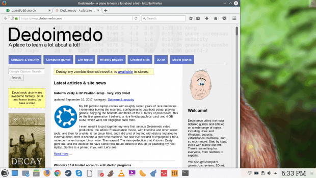
Pandora’s box of fonts is one of the many ailments of the distro world. As long as we do not have standards, and some rather strict ones at that, we will continue to suffer from bad fonts, bad contrast, bad ergonomics, and in general, settings that are not designed for sustained, prolonged use. It’s a shame, because humans actually use computers to interface with information, to READ text and interpret knowledge using the power of language. It’s the most critical element of the whole thing.
OpenSUSE under-delivers on two fonts – anti-aliasing and hinting options that are less than ideal, and then it lacks the necessary font libraries to make a relevant, modern and pleasing desktop for general use. All of this can be easily solved if there’s more attention, love and passion for the end product. After all, don’t you want people to be spending a lot of time interacting, using and enjoying the distro?
Hopefully, one day, all this will be ancient history. We will be able to choose any which system and never worry or wonder how our experience is going to be impacted by the choice of drivers, monitors, software frameworks, or even where we live. For the time being, if you intend on using openSUSE, this little guide should help you achieve a better, smoother, higher-quality rendering of fonts on the screen, allowing you to enjoy the truly neat Plasma desktop to the fullest. Oh, in the openSUSE review, I promised we would handle this, and handle it we did! Take care.


